.mesh-bg{ background-image: radial-gradient(at 80% 100%, HSLA(191,100%,36%,0.9) 0px, transparent 60%), radial-gradient(at 0% 0%, hsla(178,100%,36%,0.43) 0px, transparent 60%); animation: gradient 13s ease infinite; background-size: 200% 200%; } @keyframes gradient { 0% { background-position: 0% 20%; } 25% { background-position: 100% 50%; } 50% { background-position: 50% 70%; } 100% { background-position: 0% 20%; } }
Skip to content
Menu
Contact
Graphic Design
Geoff Sence
and more
Telling Your Story, One Design at a Time
What I Offer
My Skills
Visual
Identity
Branding
Logo
Typography
Web
Design
UX/UI
Layout
SEO
3D
Design
3D Adverts
3D Products
3D Animation
Social
Media
All Platform
Animation
Projects
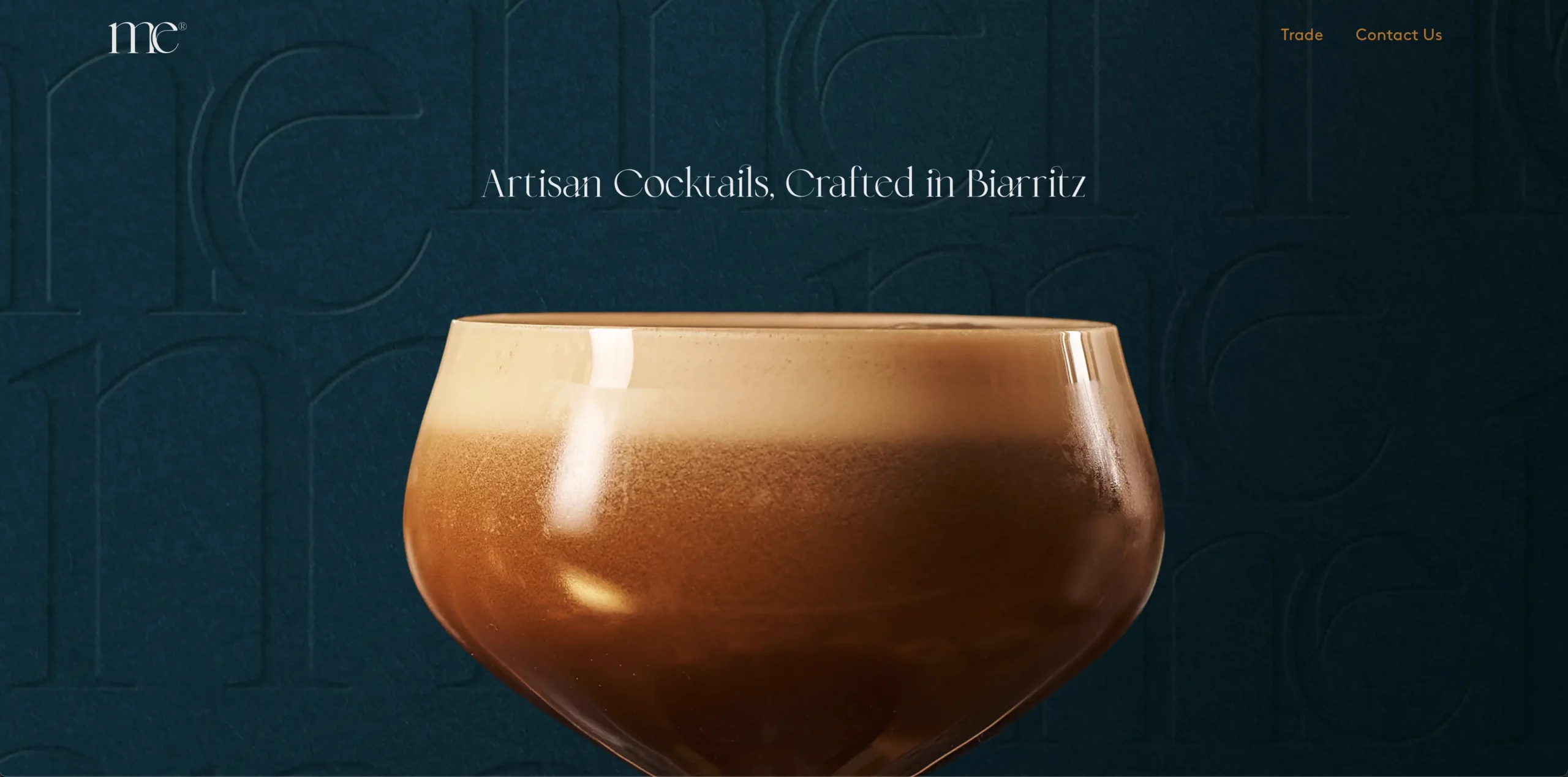
Mixology
Express
BRAND IDENTITY - 3D - UX/UI
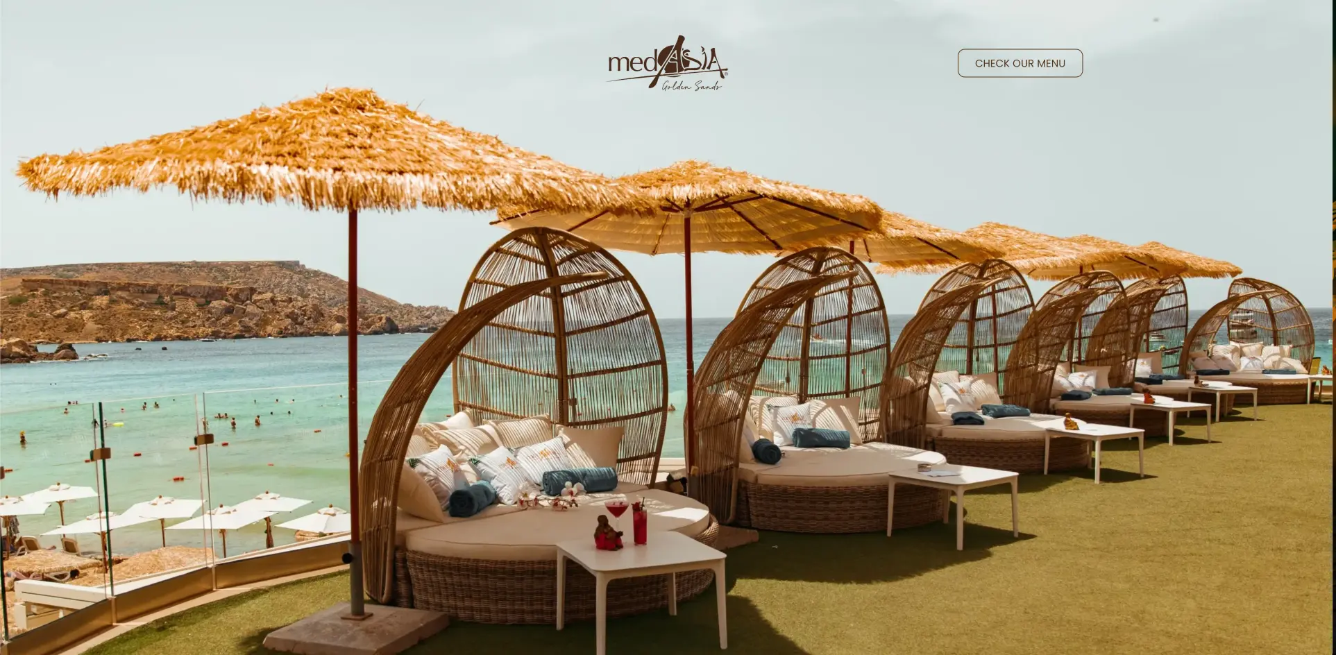
MDIA
SOCIAL MEDIA - BROCHURE - BACKDROPS
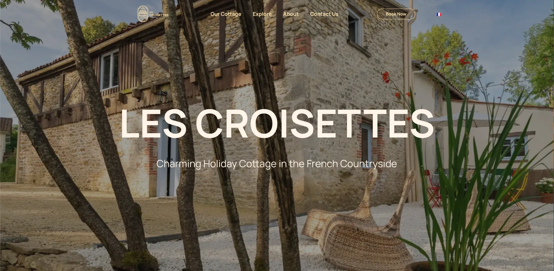
Les Croisettes
BRAND IDENTITY - UX/UI
Tommy's Fizz
UX/UI - 3D
SensiFi
Logo Design
Slowly
But Surely
Logo Design
Double A
Logo Design - 3D
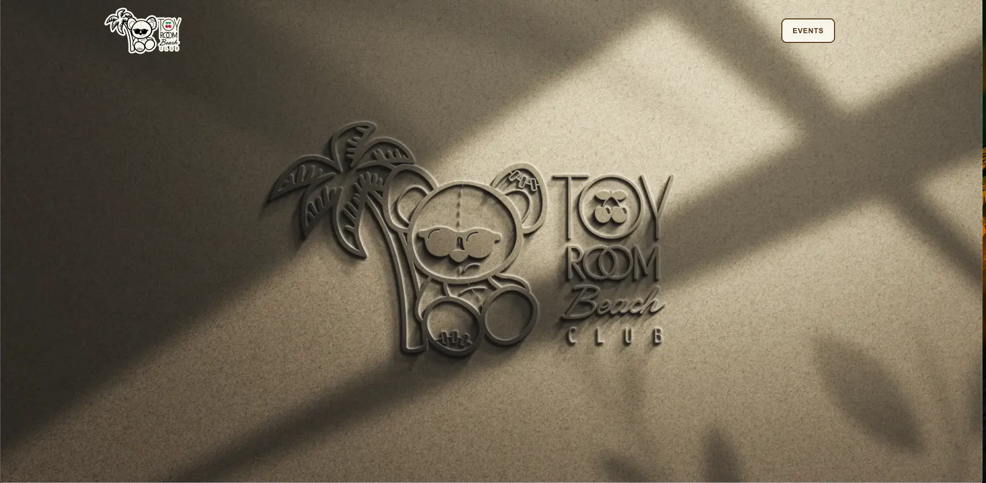
Hodgepodge
Other Projects
WEBSITES
Let's bring
YOUR IDEAS TO LIFE
Mixology
Express
BRAND IDENTITY - 3D - UX/UI
MDIA
SOCIAL MEDIA
Les Croisettes
BRAND IDENTITY - UX/UI
Tommy's Fizz
UX/UI - 3D
SensiFi
Logo Design
Slowly
But Surely
Logo Design
Double A
Logo Design - 3D
Hodgepodge
Other Projects
error:
Content is protected